Backpack React Native Progress component.
Check the main Readme for a complete installation guide.
import React, { Component } from 'react';
import { View, StyleSheet } from 'react-native';
import BpkProgress from 'backpack-react-native/bpk-component-progress';
import { spacingBase } from '@skyscanner/bpk-foundations-react-native/tokens/base.react.native';
const styles = StyleSheet.create({
container: {
flex: 1,
justifyContent: 'center',
padding: spacingBase,
},
});
export default class App extends Component {
render() {
return (
<View style={styles.container}>
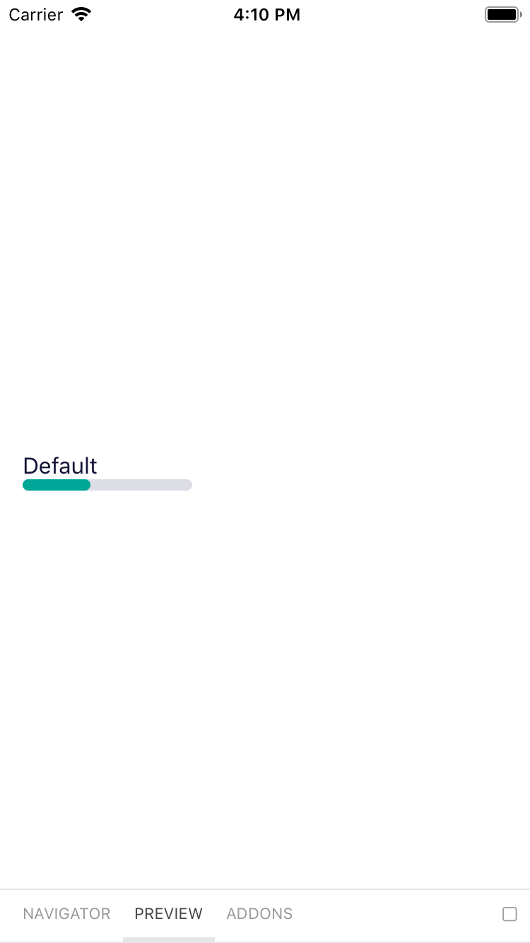
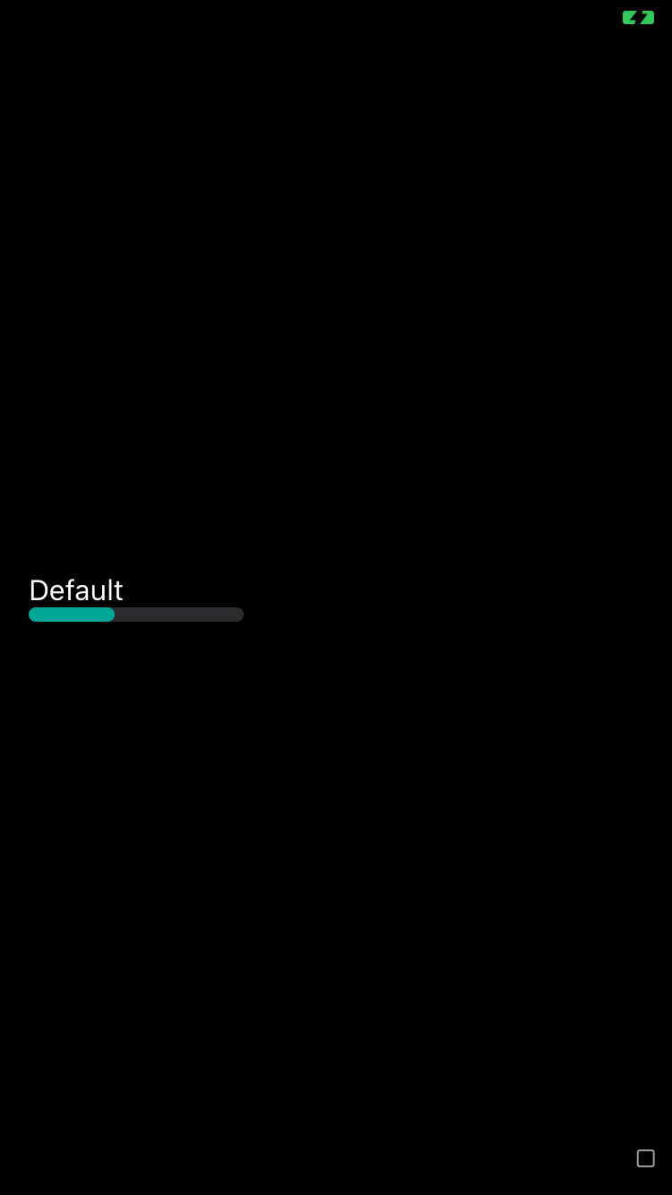
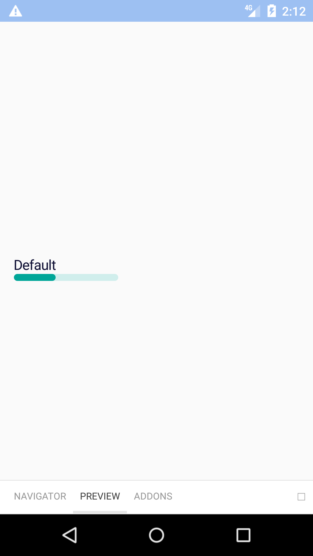
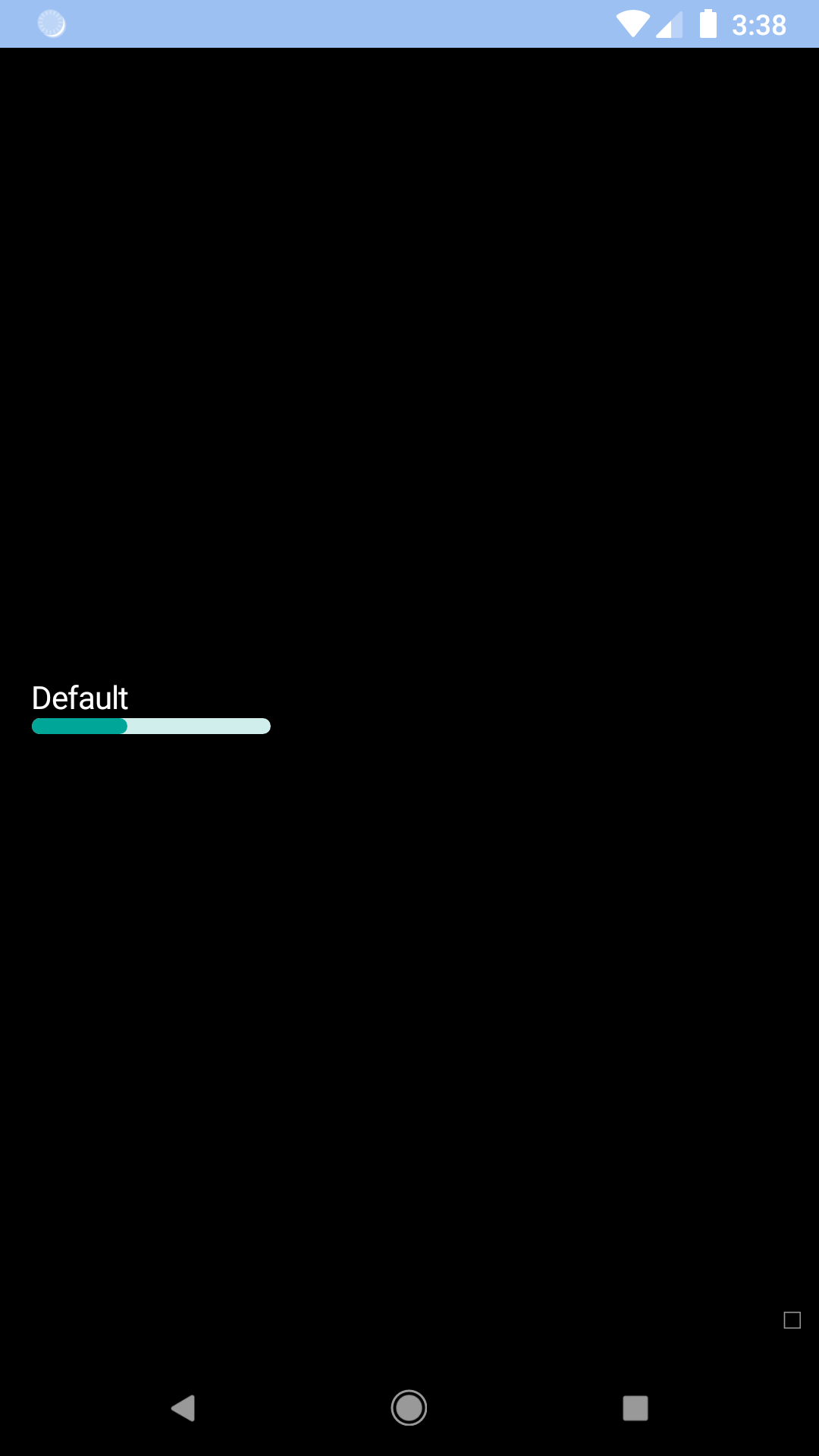
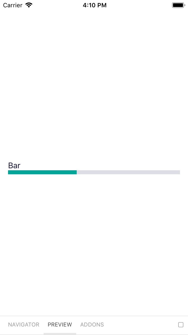
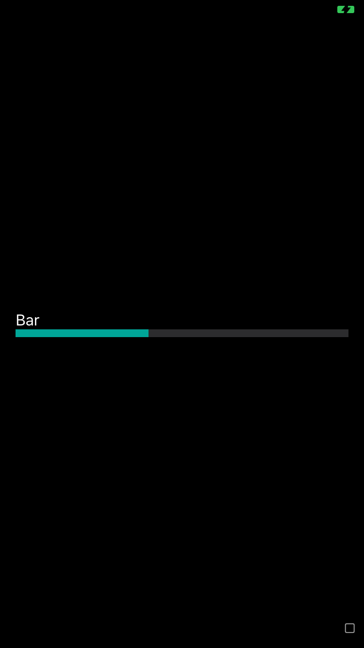
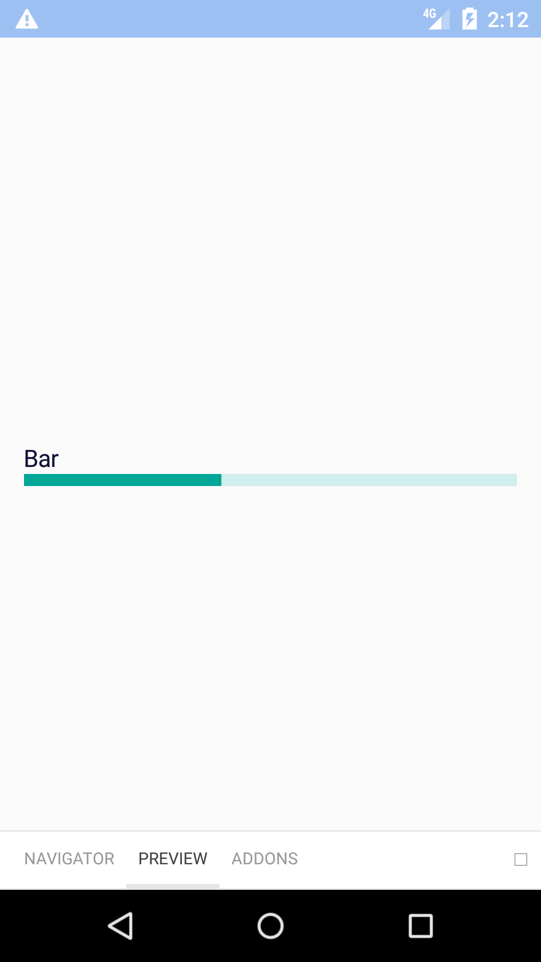
<BpkProgress min={0} max={100} value={10} accessibilityLabel="0 of 100" />
<BpkProgress min={0} max={100} value={10} accessibilityLabel="0 of 100" type="Bar" />
</View>
);
}
}
| Property |
PropType |
Required |
Default Value |
| accessibilityLabel |
oneOfType(string, func) |
true |
- |
| max |
number |
true |
- |
| min |
number |
true |
- |
| value |
number |
true |
- |
| fillStyle |
object |
false |
- |
| style |
object |
false |
- |
| theme |
See Theme Props below |
false |
- |
| type |
oneOf('default', 'bar') |
false |
default |
progressFillBackgroundColor,progressTrackBackgroundColor